Table of Contents
TL;DR
Smartphone OS visual design isn’t just aesthetics—it’s the system of hierarchy, consistency, and accessibility that makes a phone feel calm and intuitive (or noisy and tiring). iOS tends to feel “content-first” and highly consistent, Android (Material) is flexible and themeable across many devices, and Xiaomi HyperOS leans more expressive with layered, animated, “glass-like” visuals to build ecosystem identity. The best “simple yet beautiful” UI comes from disciplined layout hierarchy, typography that carries the interface, color choices that meet contrast rules, and motion that communicates state (not just decoration). If you’re designing or customizing UI, pick one design philosophy and apply it consistently—mixing styles usually creates visual noise.
Introduction
Smartphone OS visual design isn’t just “pretty pixels”—it’s the system that makes your phone feel fast, calm, and understandable (or noisy and tiring). The best mobile UI design balances beauty with clarity, predictable patterns, and accessibility, and you can see that balance play out differently across Android (Material), iOS (HIG), and Xiaomi’s HyperOS (Alive Design).
Why smartphone OS visuals matter (more than you think)
We spend hours a day inside our OS UI—unlocking, scanning notifications, navigating settings, and jumping between apps—so the OS visual language becomes a kind of “daily environment.” Apple frames this as design that supports clear hierarchy, harmony with hardware, and consistency across experiences—principles that reduce cognitive load when you’re moving fast on a small screen (especially one-handed). You can read Apple’s current guidance directly in the official Human Interface Guidelines (HIG) where it emphasizes hierarchy, harmony, and consistency as foundational ideas.
Android, meanwhile, treats the OS as a platform for many device makers and UI flavors, which is why Google’s Material Design system leans heavily on scalable components, adaptable theming, and accessibility considerations. Material’s accessibility guidance explicitly calls out the need for layouts and text that remain usable when users enable large text, magnification, or other assistive settings—crucial on smartphones where space is limited. If you want the canonical reference, start with Material’s Accessibility guidance.
HyperOS sits in a different space: it’s Android-based, but Xiaomi is trying to deliver a cohesive “ecosystem feel” across phone + IoT while still being visually distinctive. Xiaomi even names its approach—“Alive Design Philosophy”—and describes a rebuilt graphics pipeline and “dynamic glass” visuals on its official HyperOS page, which gives clues about why HyperOS often feels more animated and “material-heavy” than stock Android. See Xiaomi’s own description on the HyperOS product page.
The building blocks of great OS visual design
Visual hierarchy: what matters first
On a phone, hierarchy is the difference between “I instantly get it” and “why is everything yelling at me?” Apple explicitly calls out hierarchy as a key principle—controls and interface elements should elevate and distinguish the content beneath them—so your attention naturally lands where it should. That’s why iOS UI tends to feel “content-first,” with UI chrome designed to step back. Apple’s statement on hierarchy is right in the HIG overview.
Consistency: the secret sauce of “intuitive”
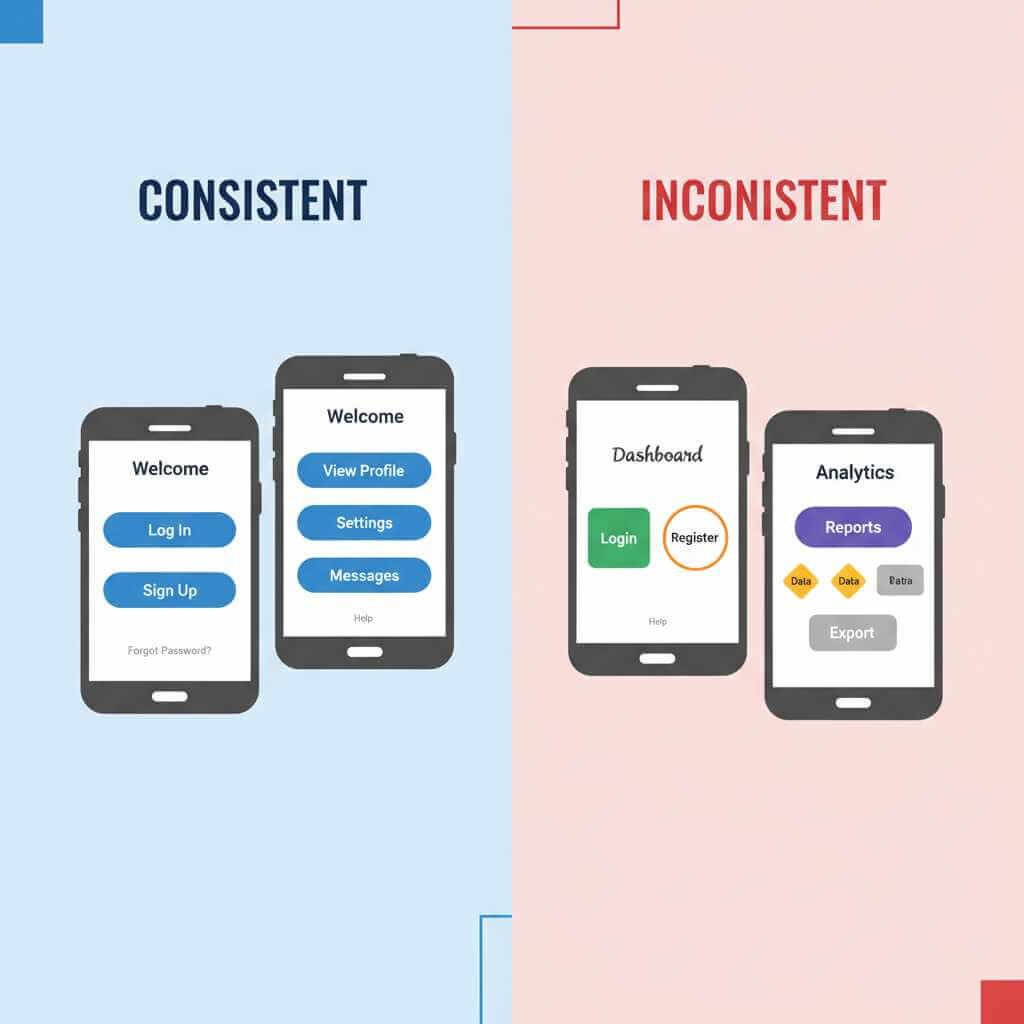
Consistency is what lets you transfer learning: if one screen teaches you a pattern, the rest of the OS should reward that learning. Apple’s HIG highlights consistency as a first-class principle, encouraging designers to adopt platform conventions so UI continues to feel coherent across contexts and sizes. This matters even more on iPhones because Apple aggressively standardizes behaviors across devices.
Android’s consistency story is different: Google provides a design system (Material) and OEMs customize it, so the best Android experiences are the ones that customize without breaking the underlying interaction expectations. Material’s ecosystem approach is why the same app can feel “native” across many Android phones when it follows Material guidance—especially around spacing, typography, and component behavior. A practical entry point here is Google Design’s overview of how Material theming helps teams build distinct yet consistent experiences: Making more with Material.
Accessibility: the design “stress test”
Accessibility is where “simple but beautiful” becomes real engineering, not just taste. Material explicitly references WCAG contrast requirements and explains that scalable text and spacious layout support users who enable large text, magnification, and other assistive settings. If your design collapses when font size increases, it’s not smartphone-ready—because phones are used in bright sun, at night, and by people with very different vision needs. The Material accessibility page is a strong baseline: Accessibility – Material Design.
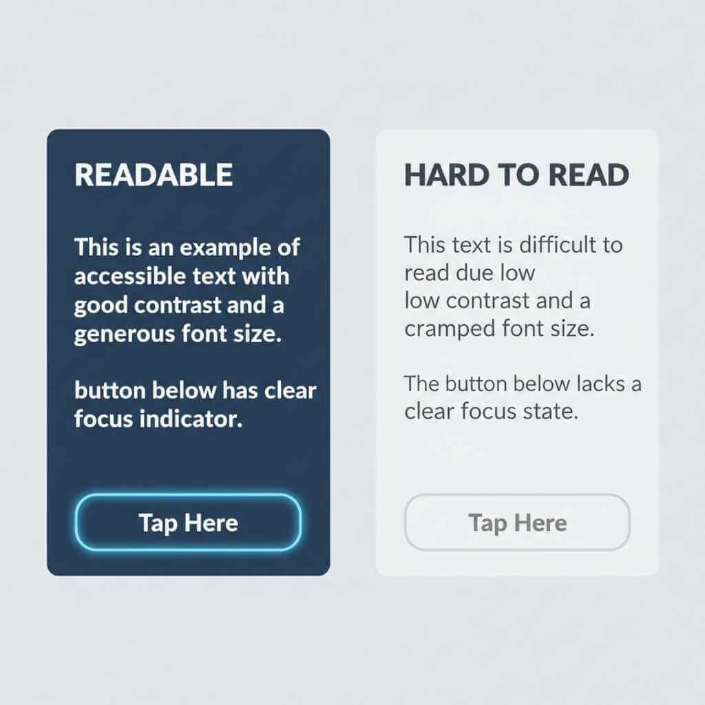
One concrete example: Material’s older guidance notes WCAG AA contrast targets like 4.5:1 for normal text (and 3:1 for large text), which directly impacts how “soft” or “washed” your UI can be before it becomes hard to read. This is one reason minimalist UIs sometimes fail in real life: they look elegant in mockups but don’t survive glare and motion. See Material’s discussion of text legibility and contrast: Text legibility – Material Design.
Android vs iOS vs HyperOS: how the visual languages differ (with real-life “feel”)
From a smartphone user perspective, here’s how these three commonly feel in daily use—especially when you’re bouncing between quick actions, notifications, and settings.
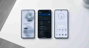
Android (Material Design): flexible, themeable, system-as-a-platform
Android’s visual strength is adaptability: Material is designed so the UI can scale across countless screen sizes and manufacturer skins. That flexibility shows up in the Material 3 approach to typography and color systems, and in practical tooling that encourages designers/developers to build accessible themes rather than hand-picking colors that might fail contrast. A useful read is Google’s codelab on accessible color systems and contrast, which explains why tonal palettes help accessibility by default: Designing with accessible colors.
Personal experience angle you can adapt: Android can look “clean and modern” on one phone and “busy” on another—even when the core apps are the same—because OEM choices (icon shapes, quick settings layout, animations) heavily influence the final look and perceived polish.
iOS (Apple HIG): content-first, highly consistent, hardware-harmonized
iOS tends to feel calmer because Apple pushes consistency and a hierarchy that keeps UI supporting the content, not competing with it. Apple explicitly frames design around hierarchy, harmony (software aligning with hardware), and consistency in its HIG, which helps explain why iOS visuals often feel “inevitable,” like they belong to the device rather than sitting on top of it. The official HIG overview is the best anchor: Human Interface Guidelines.
Personal experience angle you can adapt: When switching from Android/HyperOS to iOS, many users notice fewer “visual surprises”—controls behave more predictably, spacing feels more uniform, and the UI is less likely to change drastically between devices.
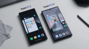
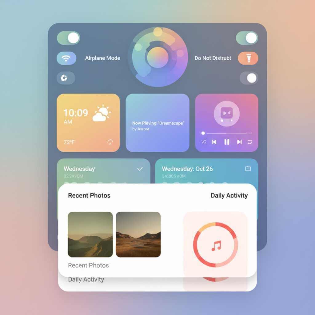
HyperOS (Xiaomi): expressive, animated, “material” visuals and ecosystem identity
HyperOS clearly leans into “alive” visuals, and Xiaomi directly calls this out as “Alive Design Philosophy,” along with claims about an “extensive graphics subsystem restructuring,” a new render pipeline, and “dynamic glass.” Whether you love it or find it a bit showy, it’s a deliberate direction: more motion and more material-like surfaces to create a signature feel. Xiaomi’s official positioning is on the HyperOS page.
Personal experience angle you can adapt: HyperOS often feels more stylized than stock Android—great when you want personality, but it can also make consistency harder if third-party apps don’t visually match the system’s surfaces and animations.
Who shapes these visuals? Major design leadership (for authenticity)
If you want to add credibility to a design-focused blog post, naming real leadership helps—because OS visuals are guided by design organizations, not abstract “the company.”
Android / Material Design leadership
Matias Duarte has been a central figure in Google’s design leadership and has held the title “VP, Material Design” (and later “VP Design”) at Google, strongly associated with Material’s evolution and Google’s broader UI direction. His professional timeline and roles are listed on his public profile: Matias Duarte – Google.
You can also reference that Material has advocacy and research leadership around accessibility and usability; for example, Yasmine Evjen publicly states she leads the Material Design Advocacy team at Google. That’s useful when you’re explaining how design systems get communicated into real products: A Year in the Life of a Material Design Advocate.
iOS (Apple UI / Human Interface)
Alan Dye has been widely reported as Apple’s head of UI / Human Interface Design (and long-time design leader), and recent reporting notes he led major interface work before leaving for Meta, with Steve (Stephen) Lemay named as his successor. For a mainstream, readable source, see The Verge’s coverage: Apple’s head of UI design is leaving for Meta.
HyperOS / MIUI (Xiaomi software design leadership)
Jin Fan is frequently cited in Xiaomi coverage as a key leader behind MIUI and now HyperOS, described as heading MIUI (now HyperOS). While Xiaomi doesn’t always publish a neat “design org chart,” this kind of attribution helps ground your post in real people rather than vague brand vibes. One accessible source discussing Jin Fan’s role is: Xiaomi HyperOS designer mysteriously disappears.
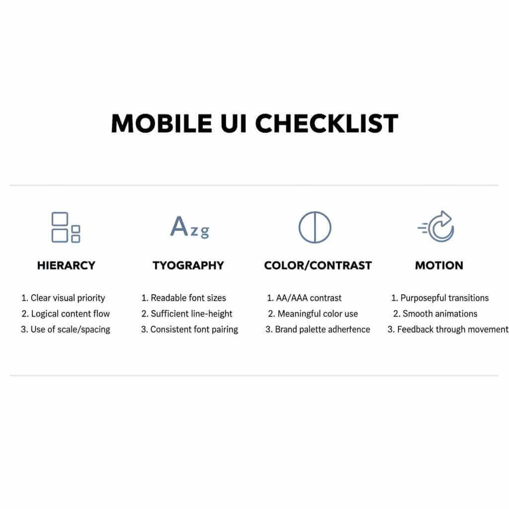
Practical guide: how to design “simple yet beautiful” smartphone UI
These are the principles that consistently produce OS-level polish—whether you’re designing a launcher, theme, widget system, or OS skin.
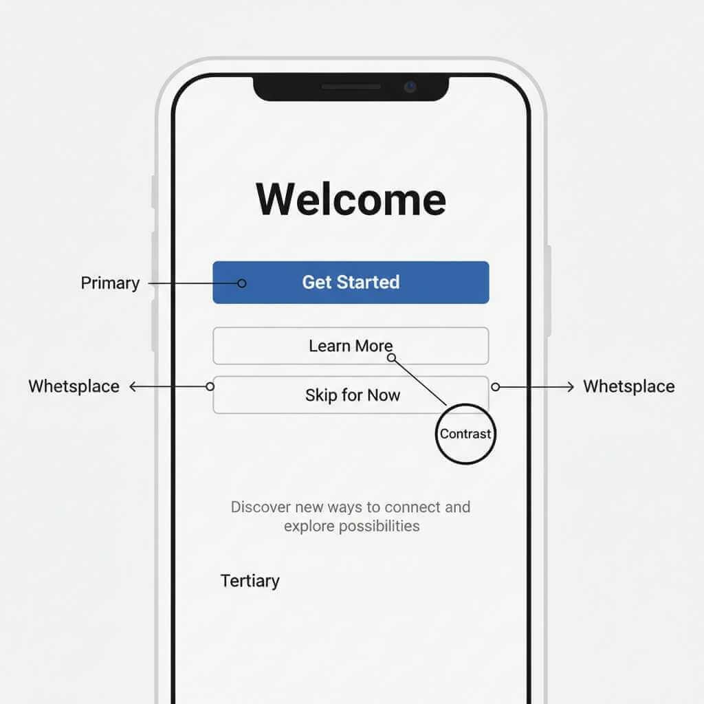
1) Start with hierarchy, not decoration
If the layout reads well in grayscale (no color, no blur, no shadows), you’re on the right track. Apple’s hierarchy principle is a good mental model: content should be visually distinguished from controls, and the UI should guide attention without shouting. Re-check Apple’s framing here: Human Interface Guidelines.
2) Make typography do the heavy lifting
Most “beautiful” mobile UIs are really typography systems with disciplined spacing. Material’s typography guidance explicitly ties type choices to visual accessibility (including contrast considerations), which matters because phones are read in imperfect conditions. If you’re aligning with Android conventions, start with Material 3 typography: Typography – Material Design 3.
3) Use color with contrast rules, not vibes
Modern OS UI often wants soft neutrals and subtle surfaces—but if your contrast fails, users feel friction instantly. Material’s text legibility page points to WCAG AA contrast ratios (4.5:1 for normal text, 3:1 for large), which is a practical threshold for smartphone readability. Use it as a non-negotiable rule, not a suggestion: Text legibility – Material Design.
4) Treat motion like UX, not “effects”
HyperOS demonstrates how motion and material surfaces can create identity, while iOS shows how restrained motion can reinforce hierarchy and spatial understanding. Xiaomi’s own HyperOS page emphasizes rendering, materials, and “dynamic glass,” which is basically a statement that the visual pipeline is part of the brand experience. That’s your reminder: animations should communicate state change, not just decorate transitions.
If you want to go from ‘I can spot good UI’ to ‘I can design it,’ a structured UI UX design course can help you master visual hierarchy, typography, color/contrast, and interaction patterns with hands-on projects you can actually ship.
Quick comparison tables (user-focused)
Visual design priorities by OS
| OS | What it optimizes for | What you notice as a user |
|---|---|---|
| Android (Material) | Scalable system design + accessibility and adaptable theming | Can look very different across brands; when done well, apps feel coherent thanks to Material conventions |
| iOS (HIG) | Hierarchy, harmony with hardware, consistency | Feels predictable and “calm,” with UI that tends to step back and let content lead |
| Xiaomi HyperOS | “Alive Design Philosophy,” strong rendering/material effects, distinctive surfaces | Often more expressive and animated; the system look is part of Xiaomi’s ecosystem identity |
Accessibility reality checks (high impact)
| Check | Why it matters on phones | Reference |
|---|---|---|
| Contrast meets WCAG AA targets | Glare + small text makes weak contrast painful fast | Material text contrast guidance (4.5:1 normal, 3:1 large) |
| Layout survives large text | Many users increase font size; UI must not break | Material accessibility guidance on scalable text/spacious layouts |
| Theming still preserves legibility | Personalization shouldn’t sacrifice readability | Material’s accessible color system explanation |
FAQ: Smartphone OS Visual Design
Q1: What does “smartphone OS visual design” actually mean?
It’s the combination of layout, typography, color, icons, motion, and component styling that shapes how the OS looks and feels during everyday tasks like unlocking, scanning notifications, and navigating settings.
Q2: Why do iOS interfaces often feel “calmer” than others?
Apple’s design guidance emphasizes hierarchy, harmony, and consistency—principles that reduce visual noise and make screens feel predictable over time.
Q3: What makes Android’s look vary so much between phones?
Android is a platform used by many manufacturers, so the same Material foundations can be expressed with different icon shapes, spacing, quick settings layouts, and animations depending on the OEM skin.
Q4: What is Material Design (and Material 3) in plain language?
Material is Google’s design system for building consistent, scalable Android experiences across devices and apps.
Q5: What is HyperOS’s visual “signature” compared to stock Android?
Xiaomi frames HyperOS around an “Alive Design Philosophy” and highlights rendering/graphics changes and “dynamic glass” style visuals, which helps explain its more expressive, layered feel.
Q6: What is “visual hierarchy,” and how can I spot it on a phone screen?
Hierarchy is how the UI signals what matters first (primary action/content) using size, spacing, and contrast so your eyes land correctly without effort.
Q7: How do I make a UI look simple without making it boring?
Use typography and spacing to create structure first, then add color and motion sparingly to reinforce meaning (state, priority, feedback) rather than decoration.
Q8: What are the quickest accessibility wins for mobile visuals?
Ensure text contrast is strong enough and that layouts still work when users increase font size or enable assistive features.
Q9: Is there a concrete contrast rule designers actually use?
Yes—Material references WCAG AA contrast targets like 4.5:1 for normal text and 3:1 for large text as a practical baseline for readability.
Q10: Who are notable design leaders behind these ecosystems?
Google’s Material direction has been strongly associated with Matias Duarte (listed publicly as VP, Material Design / VP Design at Google), Apple’s UI/Human Interface leadership has been widely reported around Alan Dye, and Xiaomi software/UI leadership is often linked in coverage to Jin Fan for MIUI/HyperOS.
Q11: Should I mix iOS-style “glass” with Android-style components in one design?
You can, but it often creates visual noise unless you set clear rules for surfaces, spacing, and motion—your post’s guidance is to pick one philosophy and apply it consistently.
Q12: What should I learn first if I want to design OS-level visuals (not just app screens)?
Start with hierarchy, typography systems, color/contrast, and motion principles—because those are the levers that create “simple yet beautiful” smartphone UI at scale.
Conclusion: what to look for (and what to demand)
If you want an OS that feels “simple yet beautiful,” prioritize hierarchy, consistent patterns, and accessibility-tested typography and contrast—then treat motion and materials as supporting actors, not the main character. Apple’s HIG principles (hierarchy/harmony/consistency) and Google’s Material accessibility guidance are excellent north stars, while HyperOS shows how a strong visual identity can be built through rendering, materials, and animation.
If you’re customizing your phone, designing a theme, or building an app UI, pick one system’s philosophy and commit—mixing iOS-like glass with Android-like components (or HyperOS-like motion everywhere) often creates visual noise. For next steps, explore Apple’s official Human Interface Guidelines and Google’s Material accessibility guidance, then compare them to Xiaomi’s own HyperOS positioning on its official HyperOS page and share which OS visuals you find most “effortless” in daily use.